Feeds:
Posts
Comments

Archive for the ‘Textile’ Category

Update: these pieces are sold, but I have others here that are similar. Please contact me using the contact form below if you are interested.

These are among the batch that is foiled and ready to go off to shops (on consignment). They also come in golden, wintry light blue and autumnal russet backgrounds. If you are interested in one of the above, or any other colour variation, please fill out the contact form below (careful not to confuse it with the comment form!).

blue birches

dk blue& grn birches

5.5″ x 9″
Hand-dyed cotton background with commercial fabric for the trees.
Details are hand-inked and the leaves are gold, silver and copper foils.
Price: $38 CDN

a quickr pickr post

Read Full Post »

I am, in the spirit of spring, clearing out some stock from my studio. You can see the first lot posted here.

All of the stock is of good quality. There is nothing wrong with it other than I simply need the space (both physical and creative) more than the stock at present.

Read Full Post »

If you are in the St. John’s (Newfoundland) area, a crafty sort and like a good deal, be sure to drop by Devon House (Duckworth Street) tomorrow morning. The Annual Seconds Sale is on and there’s plenty to see!

lots and lots of yarn some spools o' yarn

Single ply more yarn

purples and blues pinks and oranges

There’s about one hundred pounds of this stuff, dyed in marvellous colours. I’ve had to sit firmly on my hands all evening.
Bags of linen Beautiful linen
There’s about fifty pounds of this stuff, dyed in marvellous colours.
tapestry yarn Assorted stuff, including needlepoint frames

Lots of tapestry wool, needlepoint frames and kits of all sorts.

Some seconds of pottery Reproduction pottery - Ferryland historic reproductions

pottery1

Plenty of pottery, some reproductions of historic pieces!

sewing machine sewing machine label

An old sewing machine, in very nice condition….

And all sorts of other neat items:
candles Books

Fabric, assorted
All fabric is $1/m and yarns are $1/skein. Pottery is variable, but still very cheap. Books are $1 each. Magazines are $0.25

There was a lot of everything. The Sale starts at 9am tomorrow morning and runs until noon. Admission is free. We take debit/Visa/MC. Everything must go!

a quickr pickr post

Read Full Post »

Some time ago I promised to try out the effect of pyrotechnics on textiles. My intention was to grab a few samples of my work and set them ablaze. Since then, I’ve wussed out repeatedly on burning up things I’ve made. I couldn’t even come up with a “hit list” of designated ignition targets. It has become apparent to me, however, that I really ought to just bite the bullet and do this as the information/satisfaction/notoriety would be worth it in the end.

The purpose of setting my quilts/textile art ablaze is to do the following:

  • check to see how close my work is to passing Health Canada’s standards
  • come to some sort of understands of exactly how flammable my house is, given the number of quilts, wall hangings and piles of fabric therein
  • have a blast torching the heck out of things
  • make the neighbours seriously question their choice of neighbourhood
  • scare the dogs
  • thrill the kid
  • get rid of some old duds of projects that I won’t allow to be sold, yet cannot throw out. At least this way they could serve a purpose.

So I’m accumulating a nice collection of stuff. As soon as I get a clear day with minimal wind, I’ll have a go at it. Thus far it is my intention to burn the following (plus some basic pieces of cotton fabric and cotton batting, some with stabiliser, some without, some with fusible, some without, etc.):

burn-bergs.jpg burn-sunrise.jpg

Here’s your chance. If there’s anything burn-wise and quilt/artquilt-related about which you are curious, let me know and, if possible, I’ll char something for you personally. I’ll post the results, too. I can’t say that I’ll mail you the item afterwards, you understand. I’m not sure what Canada Post would say. But I will happily do such things as test the relative ignition properties of cotton versus wool batting or how quickly flame spreads on cotton versus poly-cotton thread, if you like.

It’ll probably be a week or so before I get to this. I’m thinking that this is another one of those things (like dealing with 220 electrical outlets or changing light bulbs on a ladder balanced halfway up the stairs) that I probably should do when another adult is around to put out flames and provide emergency hospital transport. So it’ll be the weekend, at least.

Taking requests……

Read Full Post »

As per Micki’s request in the comments of my last post, here’s a photo of the ugly birch fabric:

Ugly birch fabric

It’s a Northcott Lyndhurst fabric designed by Janet Orfini as a part of the Farmer’s Market series. I found it in the country-kitsch (and I mean that non-derogatorily) section of a local fabric store.

The realm of prints in these sorts of series (i.e. Thimbleberries and other country-style collections) usually don’t appeal to me personally as a theme or colour scheme for a quilt. I’m also not much into farm prints, chickens, cows or scarecrows. The individual textures of all of these things, however, fascinate me mightily.

I can see how other people might like these collections for their intended purposes, though, and have found that the often dull or muted tones of certain fabrics can be extremely useful in landscape quilting. So it’s a section that I frequent, when I’m not painting my own fabric, but not, I suspect, for its most popular use.

Actually, one of the ugliest fabrics I’d ever seen (and we’re talking truly hideous) turned out to have just the right textures (looked like moldy wood) to serve as the background fabric for the tree in this picture:

Whose Woods These Are

You see those spots? Yeah, they look fine for the tree, but as a whole sheet of brown, grey and taupe covered in what I swear resembled mildew, it was entirely unappealing.

This is why I don’t throw out ugly fabrics that happen to be in the colour schemes in which I often work. Thus far, just about every ugly fabric has served a very unique and essential purpose in some piece or other. I’m usually quite dubious at the outset, but it always seems to work out.

The piece below contains three or four almost-ugly fabrics. The trees, in the background, behind the house? Unattractive grey-green that I used as the basis for enhancing with fabric pastels. Some of the rock and grass fabrics were also entirely unappealing, although not truly into the realm of hideous. Sometimes an ugly fabric can be transformed when cut up into smaller pieces. Sometime it takes chopping out or covering over certain blotches or areas. Quite regularly, I over-paint, add details or over-dye fabrics that have the right texture, but need a colour change. Occasionally, as in the trees below, the colour is right, but the texture needs to be created.

Passages

detail of passages

So treasure your uglies, especially if they are in anyway reminiscent of your usual colour schemes or creative habits!

Incidentally, if you haven’t already checked out Micki’s blog, it’s well worth a regular read. Recently she posted about burning the bejeezus out of painted Tyvek, a trick I’ve wanted to try for a while but am holding off on until I can do it outside (bad fumes). Summer’s coming, though!

Read Full Post »

Over the last few days, I’ve been preparing summer stock for two of the shops I supply. Most places around here like to be in full swing by mid-May, so I generally aim to have things in their hands by mid-April.

This week has been a week of birches. I use hand-dyed cotton fabric (low water immersion dyes using Procion MX, in case you’re interested) for the backgrounds and fussy-cut the pieces for specific spots in the fabric. Wastage is minimal, however, as the smaller works (4.5″ squares, for instance) can make excellent use of sections of fabric that would look just plain wrong for larger backgrounds. Below are thumbnails of two of the pieces used:

7a 6b

The trees are a commercial (ugly as sin) fabric that, when cut into strips, looks not bad at all. I cut the strips freehand with a rotary cutter (yes, it’s tricky to get things even) and tend to cut from several different pieces of the same fabric so that the trees don’t all end up having the same curvature or the same repeats in the fabric print.

As you can see below, the background with the strips laid in place:

Unshaded

These will be cut into three panels each when finished, hence the somewhat odd arrangements of tree trunks.

When working in a series like this, I also streamline the process by cutting out fifty or a hundred trees at once and then arranging them afterwards to suit the individual composition. I’ve discovered that I don’t really like being a one-woman assembly line, churning out the same piece time after time. I prefer to work on a reasonable number of pieces that are of a similar theme in one go. This allows me more variety, less stultification and, most importantly, gives each piece the attention and space it needs to be original as it grows and evolves.

After laying the trees in place, I then hand-shade the trees to add curvature to the trunks. As you can see below, the effect is not only one of added depth, but also adds drama to the composition and enhances the effect of the trees moving towards the viewer, off the background. The work is built up another layer from the furthest visual point.

I’ve spent several days penning in the details on these tree pieces and can say with certainty that if the devil isn’t in the details, he sure as hell rejoices in their existence.  Small, refined motions of shading for days on end are not good for the body.

A shot of two smaller pieces showing the shading(these were two of my favourites from the week)

yellows

The effect is even visible from a distance in the larger pieces:

Shading done!

It’s interesting to see the contrast between shaded and unshaded trees in the same piece. The first shot below is half-shaded. The second shot is with shading complete.

before & after 3after entire

Today’s task is to pen in all the branches, layer the piece with stabiliser and push the whole batch towards completion. To that end I have to:

  • add branches
  • stabilise panels
  • cut panels into tryptiches
  • prepare backings and attach hanging devices
  • layer panels with backing and centre stiffener (plastic canvas is a wonderful stiffener for such things; inert, waterproof, doesn’t stain and won’t kill a sewing machine if you accidentally or purposefully sew through it. Cheap, too.)
  • stitch edges
  • attach cording
  • apply glue
  • apply foil for leaves (Foiling is always the last step for these pieces.)

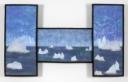
The result will be a variation on this (apologies for the rotten picture):

green birches

With details looking like this (again, bad picture. Colours wrong. Sorry. Will photograph the current series properly when completed!):

blue birches detail 2

blue birches detail 1

blue birches detail 3

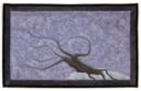
And some of the smaller pieces from a past rendition of this idea:

foiled birches

foiled birches many

So I’m off to work. Proper pictures will follow…..

a quickr pickr post

Read Full Post »

Just got word that my workshop (details below) for Quilt Canada 2008 has been approved! Yay! Another proposal pans out!
If you’re interested in taking it, it’ll be on June 4, 2008 at Memorial University of Newfoundland, St. John’s, Newfoundland.

For more information, you can check with the folks at the Canadian Quilters’ Association (although they haven’t got the workshop info for 2008 up yet).

I’ll be teaching this class locally at least twice over the summer and fall as well, so if you’d like to be on the list for an earlier class, drop me a line.

I’m contemplating an on-line version at a later date.

——————————

A Feel for the Land: Creating Texture in the Canadian Landscape
Workshop proposal – Quilt Canada 2008

by Vicky Taylor-Hood

Class description:

Students will work on a myriad of techniques that can be used to given dimension and texture to textile landscape art. Special attention will be paid to achieving effects that illustrate the Newfoundland environment. These will include (but are not limited to):

  • creating icebergs through layered, fused materials as well as through the use of stitched layers of sheer fabrics
  • depicting realistic rocks by using fused snippets, painted and hand-detailed fabric and painted spun polyester (a.k.a. used dryer sheets)
  • illustrating spume and surf through the use of machine lace and Angelina fibers
  • using painted cheesecloth, tulle, organza, metallic foil and thread to accentuate light and shadows within a landscape
  • creating foliage through painted dryer sheets
  • aspects of house construction

All of these techniques will be demonstrated and students will have the opportunity to create samples. Some students will simply wish to take their ideas, samples and the materials provided home with them to work on their own. Those who feel sufficiently confident to leap from observing a demonstration to creating a finished product on the spot will have the materials available and the opportunity to do so. There is no set finished project for this workshop. It is rather an acquisition of tools with which to embellish the students’ own landscape designs. Students will take home with them the samples they have made and any unused materials that were in their kits.

Level of expertise: This session is geared towards intermediate to advanced quilters. Beginner quilters are welcome, but may find they need to supplement what they learn with more general quilting skills.
Length of class: six hours

Class size: minimum of 8, maximum of 15

Fees: registration for this class will be handled by Quilt Canada. There will be an additional $20 materials fee.

Read Full Post »

Found in the mailbox today……

artproc21.jpg

Sometimes I get the (obviously erroneous) feeling that all the work putting together proposals and filling out forms is much hassle for little reward. Things like this reaffirm that taking that little bit of extra time pays off.

What a way to kick oneself out of the doldrums of winter, eh? Just what I needed to push through to another couple of deadlines!

My resolution from last year, which was to continue to put out proposals and submit larger quantities of work to a variety of venues, is paying off already.

Read Full Post »

Sari yarn

I picked up some sari silk yarn today at the local wool store, Wool Trends. It’s fabulous stuff and should prove eminently useful as I work through some of my next projects (another couple of books, a series of boxes and some bowls and vases). I have great hopes for it!

As an aside, Wool Trends is one of those fabulous shops that is crammed with all sorts of fibres.

One that caught my attention, apart from the sari silk, was Seasilk, a seaweed fibres and silk composite. I almost bought some and may yet go back for it (I just need a definitive purpose for it, as it was expensive). Have a look at the colours. They truly are as vibrant as they appear in the photos and the feel of the stuff….. it’s like flexible pussy-willows that drape like they were a part of your skin. Amazing stuff. All I need is a use for some….

Read Full Post »

paints.jpg

Ah, I love having an chance to play with some new products. Recently I wandered through Kent Hardware store (Kent are the spawn of Irving, a New Brunswick company) and discovered that they are ceasing to carry the Pebeo line of art supplies. The remainder of the paints were seriously discounted (I paid $1.30 CDN for a $7 bottle) and included some of the silver glitter finish and the expandable paints. Score!

The silver glitter finish isn’t bad at all. It’s basically glitter in some sort of acrylic medium suitable for use on fabric. You can paint it on already painted and dried fabric and the base dries clear. You can also mix it in with the other acrylic-based paints. Opaque paints will obscure the glitter a good bit (unless the glitter happens to be on top of the paint), but the transparent paints mix well with it and the transparency of the paint allows the glitter to shine through, although the sparkle is somewhat diminished.

The glitter hold on well during a wash (I didn’t machine dry it) and is fine after being ironed with a pressing cloth (ironing the fabric from the back would likely achieve the same effect). It seems to rub off a bit when you rub it hard, so it’d probably be better for things that got minimal abrasion and washing.

The sparkle of this isn’t overpowering, also, so it’d be reasonable to use moderately in landscape quilts (snow in moonlight, for instance, or water shimmering). Heat setting makes a definite difference to how well the glitter adheres, btw.

The expandable paint was also rather niffy. I’d read about it a bit in Quilting Arts (issue 24, winter 2006 – Linda Schmidt) and was therefore rather keen to add it to my repertoire of techniques and tools. Finding it on sale was an added bonus!

I tried it several different ways. Firstly, painted on parchment paper rather thickly, allowed to dry, ironed and then peeled off. This gives me the option of creating pieces that could be sewn or glued as layers in a work. The resulting pieces were rather brittle, however, so care needs to be used in peeling them off and handling them. They painted nicely, though:

rocks1.jpg

The expandable paint was wonderfully easy to work with, although I think a squeeze bottle with a fine applicator tip would be excellent for very detailed work. As it expands in all directions after heating, you need to start with rather fine lines for such things as tree branches:

tree.jpg

But I like the effect. It’s white and dries white, so tinting it before using is helpful. After it has dried and then been heated, you can rather easily paint right over it as I did with the tree above. A keeper as far as materials go!

Finally, I ‘ve been playing with the Sprinklettes (not a girl group from the fifties), purchased at Michaels.
glitter.jpg

Basically, it’s iridescent glitter that can be mixed with paint and used on fabric. You can also stick it on with fabric glue. I’ve only played with this a little, but I have found the following:

  • it needs to be mixed with its adhesive, not just sprinkled on top
  • if just sprinkled on top, much of it will wash or rub off
  • a fine coat of thinned fabric glue over top of it really helps to keep it on
  • it mixes well with fabric paints, especially transparent ones
  • it’s quite visually powerful and easily overdone
  • it is attracted to everything via static electricity
  • it gets everywhere. And I mean everywhere. Places that will astonish and thrill your husband kind of everywhere.

Here’s what colours come in the bottle:glitter_bottom.jpg

Now that I’ve got the sparklies out of my system (and underwear), I’m off to do some preliminary sketches for another series.

Read Full Post »

Older Posts »